A recent study looking at “cross-correlations of American baby names” revealed something very interesting.
Popular baby names in one state tend to be correlated with popular baby names in nearby states, and during most of the 20th century, the two main correlations were north and south.
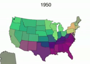
But in the 1980s and 1990s, this long-standing pattern shifted.
Now, the two main correlations are roughly the coasts and the central states (especially the Northern Plains states).

The authors of the study didn’t include any theories about what might have caused the shift…do you guys have any guesses?
Sources: Cross-correlations of American baby names (abstract), How baby names vary state to state
Images: Screenshots from video “How baby names vary state to state” © P. Barucca, J. Rocchi, E. Marinari, G. Parisi, and F. Ricci-Tersenghi/PNAS
From looking at the 2000 map, it looks like that most of the green areas are those with a larger number of immigrants (especially Hispanics) and are more urban than average*. Excluding that you still see some of a “north vs. south” difference (the dark purple vs. light red), but not as great as the green vs. others difference.
*Notice how Florida is quite different from the other “Southern” states (besides Texas with a similarly large Hispanic population), how Vermont, New Hampshire, and Maine (more rural and whiter than the rest of New England) are more like other northern states farther west than their regional companions, and how Illinois is greener (thanks to Chicago) than most other Midwestern states. These “outliers” to their regions demonstrate the probable ethnic and urban/rural factor.
Also with how the study only involved girls’ names – since at least in modern times there tends to be more regional variations (based on SSA data) with boys’ names including them would’ve probably further refined the results.
Great point about the states with larger urban and Latino populations — that makes a lot of sense.
Argh! Their colour coding is really awful: The purple mid-northern cluster is far away from the red mid-southern one, but the eye wants to merge them into a continuum. In their paper they also use clustering with a fixed number of three clusters (too low, IMO) that shows the mid northern and southern clusters as different from the rest.
I am also not convinced that their methods are really an argument for the far fetched conclusions they draw.
I found a link that shows the correlation for the boys too:
http://www.citylab.com/work/2015/06/mapping-the-spread-of-us-baby-names-over-the-past-100-years/396440/
Thank you for that link, Kelly!